Too often I stumble upon a restaurant website that isn’t up to the right standard. It’s not mobile friendly, information is not available, links are not working, the design is outdated. And it’s not just the ‘mom and pop’ places where I see this happening. Even new, hip places or restaurants that have been around for a long time seem to make these same mistakes. So in this post I am going to tell you 5 big mistakes you might be making – and some tips on how to solve them.
1. Outdated Design
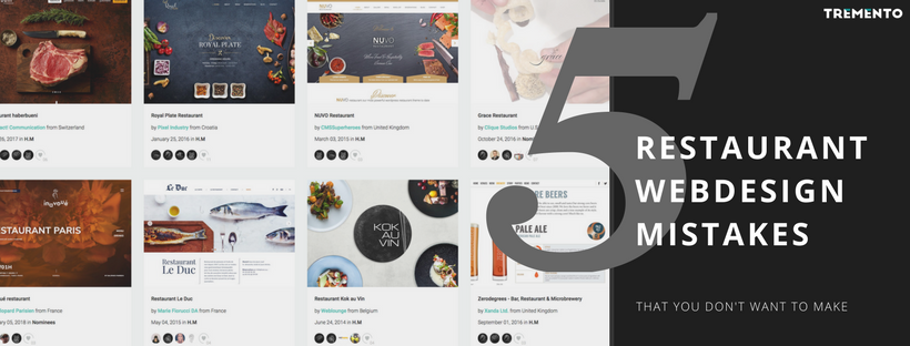
It’s 2018 and your website visitors are used to beautiful and highly functioning websites. It’s no longer a question whether you should have a website: that’s a fact. But just having a website is not enough. You need to make sure your website is designed with your target audience in mind. And it should function the way they expect your website to function. No hidden buttons, no wrong links, no pixelated pictures. Yes, your customers are demanding. But luckily, finding a good designer is not that hard.
So what can you do?
First of all, create a site-map. This is something you should do before even getting in touch with a designer. Put down on paper what information your website could contain. My suggestions for essential pages would be: home, our story, gallery, our menu, contact & location. Feel free to add more to this.
Also, if you are able to maintain a blog, then do so. A page with ‘news’ would be perfect, because if you post a news-item or a blog post every now and then, your website automatically starts to show off you’re keeping it up to date. And your customers will love this.
The second step would be to think about your restaurant’s style and message. What makes you unique? What should be in the spotlight? What’s your story? If you can put this into words and communicate this to your webdesigner, he or she will be able to bring your site to the next level. From a generic website to something more authentic and unique. A website that truly represents you can easily turn wandering online customers into real guests. If you want to learn more about this or if you want a new webdesign, feel free to contact me. I’d be happy to help you.

2. No menu on your website
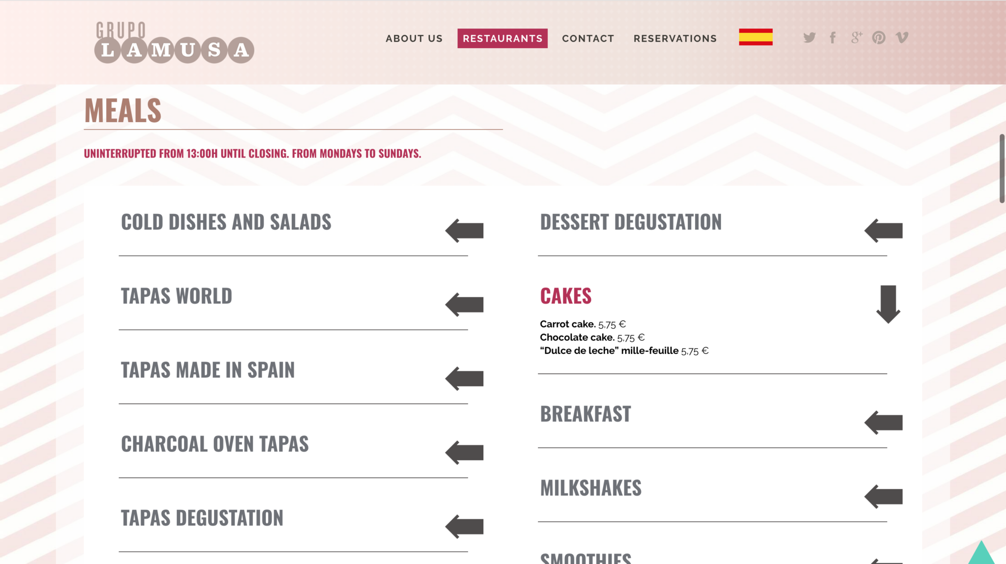
Not posting your menu on your website is a complete no-go. People want to know what they can expect upfront. Especially now with so many vegetarians, vegans, dieting or gluten-free restaurant visitors out there. They are eager to know if there are menu options for them – and no, they are not going to ring you up to find out. If your menu is not on your website, you’re out. They will find another restaurant who does have its menu online and they’ll go there.

3. Not mobile friendly
Tourists and young people are bound to search for your restaurant through their mobile phone. They might find you through an app and be redirected, or directly through Google or Google Maps. They will land on your website on their smartphones. If they are unable to navigate through your website on their phones, you lose. The time the average customer will spend on your website searching for the menu or the right button is extremely short. Your website visitors want an easy experience. Therefore your website should 100% be mobile optimized. Look at your Google Analytics if you have them installed and you will see the majority of your website visitors come to your site via their smartphone. Don’t underestimate it. This is key to get people to your restaurant.
So how to solve it? Well, if your website isn’t mobile optimized yet, go talk to your webdesigner. Explain that you need your design to be optimized or to be redesigned. It needs to be responsive, meaning it will work well on each different screen size.

4. A lack of information
Another no-brainer, yet something so many restaurant, lunch rooms and coffee shops fail at: information. There are a few key things people will look for on your restaurant’s website: it’s the menu, opening hours and contact details. After that it’ll be photos of the food, your reservation system and maybe reviews. But those first things, the menu, opening hours and contact details have to be stated somewhere very, very clearly. People need to be able to find your address and contact details without any difficulties. Make it as easy as possible.
5. No visual content
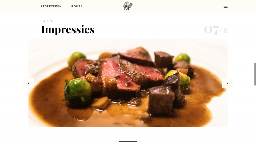
We’re living in the digital age, which means: content, content, content. Visual content. Your visitors are driven by visual advertising all day long. They look at food pictures on Instagram, at 1-minute videos on Facebook and shows like Chef’s Table on Netflix. They looooooove visuals. So not having any visual content on your website is like shooting yourself in the foot. Get a photographer to snap some beautiful images of your food. This will not only serve as great content for your website but also for your social media channels. It will be well-worth the investment.

Conclusion
There you have it. Five mistakes you might be making with your restaurant’s website. If you recognize yourself in any of these, then please: get to work. You don’t want to be the one missing out on guests by making mistakes that are so easy to resolve. If you need any help, consultancy or tips on your website, feel free to drop me an e-mail or a comment below. I’d be glad to take a look.


