When it comes to beach resorts, first impressions are everything. Before guests ever step foot on white sand or sip cocktails by the sea, they often experience a resort through its logo. A well-designed beach resort logo doesn’t just look good; it communicates the destination’s vibe, story, and promise. From tropical flair to luxury tranquility, logos visually immerse travelers into what they can expect.
In this article, we’ll explore how beach resorts leverage their logos to set the tone for memorable vacations. Plus, we’ll showcase 10 great examples of beach resort logos and highlight three standout features of each.
Table of Contents
- The Role of Beach Resort Logos
- 10 Great Examples of Beach Resort Logos
- 3 Things to Keep in Mind When Designing Your Resort Logo
The Role of Beach Resort Logos
Logos act as a silent storyteller for beach resorts. Whether simple or intricate, they can convey:
- 🧘 Relaxation and luxury: Elegant fonts, soft colors, and minimal designs often communicate upscale tranquility.
- 🏖️ Playfulness and adventure: Tropical elements like waves, shells, and vibrant hues appeal to family vacations and water sports enthusiasts.
- 🌟 Authenticity: Logos reflecting cultural or natural elements, like local flora, fauna, or patterns, create a deeper connection with the destination.
These visual cues allow travelers to form emotional bonds before even arriving!
A well-crafted logo does more than identify a brand. It sets the tone, builds emotional connections, and can inspire travelers to choose one destination over another. By embracing elements of nature, culture, and design, beach resorts can make their logos unforgettable 💡
That said, a great logo won’t make a great resort. But a bad logo can definitely ruin the opportunity for another booking 🫣
A super vibrant, all-colors-of-the-rainbow logo might make your resort look cheap. Maybe you thought you were going for playful, but you’ve got to be careful when incorporating color. Too much can overwhelm your audience and dilute your brand’s message. Instead, be intentional with every hue and element 🎨
Your logo should reflect your resort’s identity—relaxed, luxurious, adventurous, or boutique. Make sure to evaluate these aspects carefully when selecting a logo or working with a designer. After all, beach resort logos are often the first step in building a relationship with a guest 🤝
10 Great Examples of Beach Resort Logos ⤵️
Here’s a closer look at some stunning beach resort logos, each with a unique identity that perfectly reflects its brand.
1. ‘Alohilani Resort – Waikiki Beach
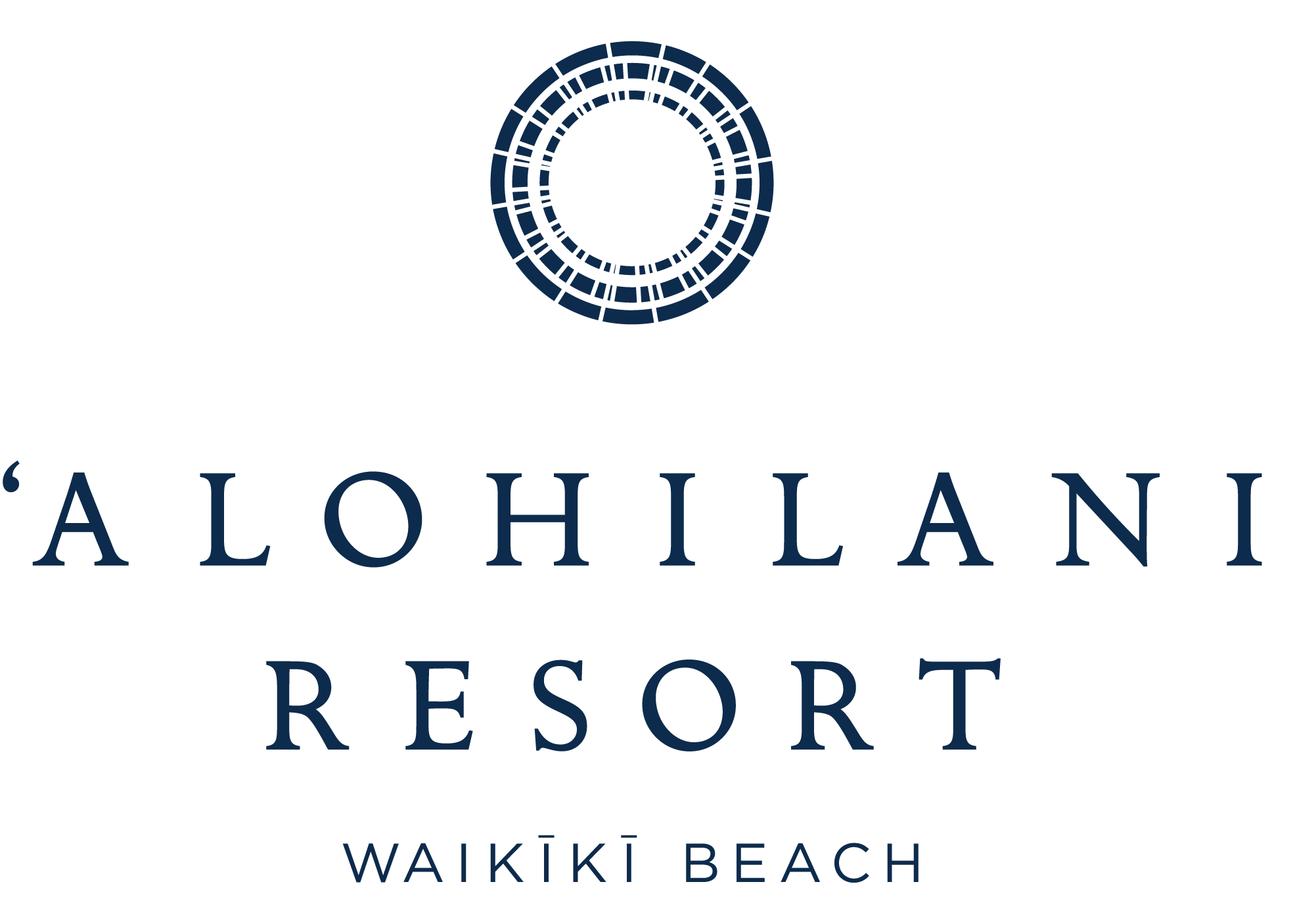
- Timeless and Elegant Design: The circular symbol evokes a feeling of unity and connection, while the clean, serif typography feels luxurious and timeless.
- Cultural Significance: The name ‘Alohilani (“heavenly brightness”) connects to Hawaii’s rich cultural roots.
- Simple Yet Memorable: The minimal design exudes calm sophistication, perfect for a luxury getaway.
2. Afroditi Venus Beach Resort – Santorini
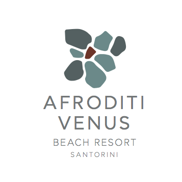
- Nature-Inspired Elements: The stone-like graphic reflects Santorini’s rugged beauty and volcanic origins 🌋
- Calming Colors: Muted greens, soft blues, and earth tones embody relaxation by the Aegean Sea.
- Modern Typography: A sleek font balances tradition with a contemporary feel, appealing to all generations 👴👨👩👧
3. Aiyanar Beach & Dive Resort
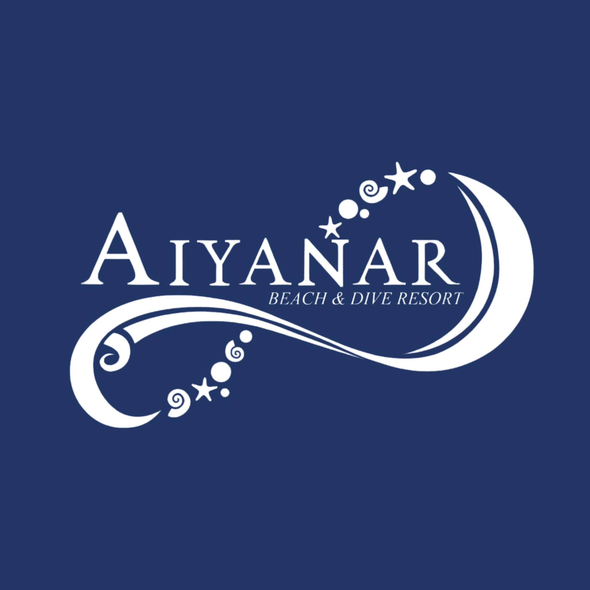
- Dynamic Wave Motif: The swirling wave and stars capture the essence of diving adventures and underwater beauty 🌊
- Bold Contrast: White elements against a deep blue background reflect the ocean’s mystery and serenity.
- Playful Yet Professional: The logo strikes a balance between adventure and relaxation, making it approachable and exciting.
4. Coyaba Beach Resort – Grenada

- Organic Design: The earthy brown tones and circular motif mirror Grenada’s natural landscapes.
- Cultural Touch: The Caribbean influence is visible through simple yet bold patterns, enhancing authenticity 🌴
- Friendly Typography: The rounded letters feel warm and inviting, creating a sense of home for guests.
5. Estrela Do Mar – Goa
- Artistic Symbolism: The radiant fan-like design represents a seashell (or the setting sun, if you will!) over Goa’s beaches 🐚
- Trendy Minimalism: A clean, modern style appeals to young travelers looking for a chic escape.
- Soft Color Palette: The coral background and white emblem evoke coastal charm and sunset hues.
6. Gambia Coral Beach Hotel & Spa
- Nature-Centric Graphics: A seashell and coral star immediately emphasize the oceanic theme 🏝️
- Vibrant Balance: The split teal and coral colors add a fresh, vibrant energy that feels both fun and upscale.
- Classic Typography: The bold serif font exudes professionalism and luxury without being overbearing.
7. K’gari Beach Resort
- Personal Touch: The handwritten script adds warmth and a sense of intimacy, like a handwritten invitation ✍️
- Natural Symbolism: The palm tree silhouette perfectly ties into the laid-back, island vibe.
- Earthy Colors: The terracotta circle resonates with the land’s natural beauty, appealing to eco-conscious travelers.
8. Mahekal Beach Resort
- Cultural Representation: The intricate turtle icon reflects local Mayan heritage and coastal wildlife 🐢
- Color Harmony: The turquoise and brown palette ties together the sea, sand, and cultural roots.
- Modern Font Choice: Clean, simple typography balances the ornate icon for a contemporary feel.
9. Praia D’el Rey Golf & Beach Resort
- Refined Iconography: The seahorse design is both playful and elegant, symbolizing ocean charm and luxury ✨
- Deep Blue Palette: The dark blue tones exude sophistication while reflecting the ocean’s depth.
- Strong Branding: The typography is bold and professional, ensuring high visual impact.
10. The Waterfront Beach Resort
- Flowing Design: The wave-inspired icon blends seamlessly into the text, capturing the essence of water.
- Subtle Elegance: A muted brown hue feels earthy and upscale, appealing to sophisticated travelers.
- Classic Font: The serif font choice provides a timeless, professional look for a luxury experience.
3 Things to Keep in Mind When Designing Your Resort Logo 🚨
- Color Choice: Be careful with bright, overwhelming colors. Too much vibrancy can make your resort look cheap instead of playful. Stick to 2-3 complementary tones that reflect your vibe—calm, luxurious, or adventurous.
- Keep It Simple: A clean, memorable design works best. Avoid too many details or fonts. Simple logos are easier to recognize and look great on everything from signage to social media.
- Match Your Personality: Your logo should tell your story. Whether you’re a laid-back eco-retreat or a luxury getaway, choose symbols and fonts that reflect who you are.
A thoughtful logo sets the stage for a great guest experience—make sure it sends the right message.
Final Thoughts about Good Beach Resort Logos 💭
Beach resort logos are an essential part of creating a first impression that lasts. From playful and tropical to refined and luxurious, the best logos capture the soul of the resort and beckon travelers to explore. Ready to make waves with your own design? Dive in and let creativity lead the way.
🌴 Love design tips like these? Dive deeper into the world of branding and get exclusive insights, case studies, and practical advice delivered straight to your inbox! ✨ Sign up for our newsletter today and learn how to craft visual identities that capture the true essence of a getaway, just like your favorite beach resorts! 🏖️

