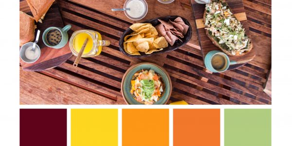
Every brand should have a color palette. Using the same color palette in all your design does not only help to build brand recognition: it’s also a key ingredient in your communication. Do you know how blue is conveyed as ‘cold’, ‘water’, ‘peaceful’? And how red signifies ‘hot’, ‘passion’ and sometimes ‘sexy’? Colors have meanings. And you should make use of them if you want to build a solid brand.
But how to pick your palette?
The trick is to not just pick any colors. Put some thought into your choices. Luckily, there are a few tools that can help you here. We are going to look at these tools, a few examples and color meanings in order to set up your palette.
The first step is to select about 4 to 6 photos that truly represent your brand. Pick photos from your property that you feel are very typical. Or, if you are a restaurant, you might also want to look at your food and/or drinks. I advise to pick photos that you have taken yourself or could have taken yourself. Why? Because it’s likely that these are also the kind of photos you will take in the future.

Coolors.com
The next step is to head to https://www.coolors.com. This tool will help us to create a color palette very easily based on our photos.
- Make sure you have your photos ready to be uploaded. Collect them in 1 folder on your computer. If their size is bigger than 5MB, I recommend you to first resize them with https://bulkresizephotos.com/. I’ve had coolors.com give me the error ‘not a valid image’ when my photos exceeded 5MB.
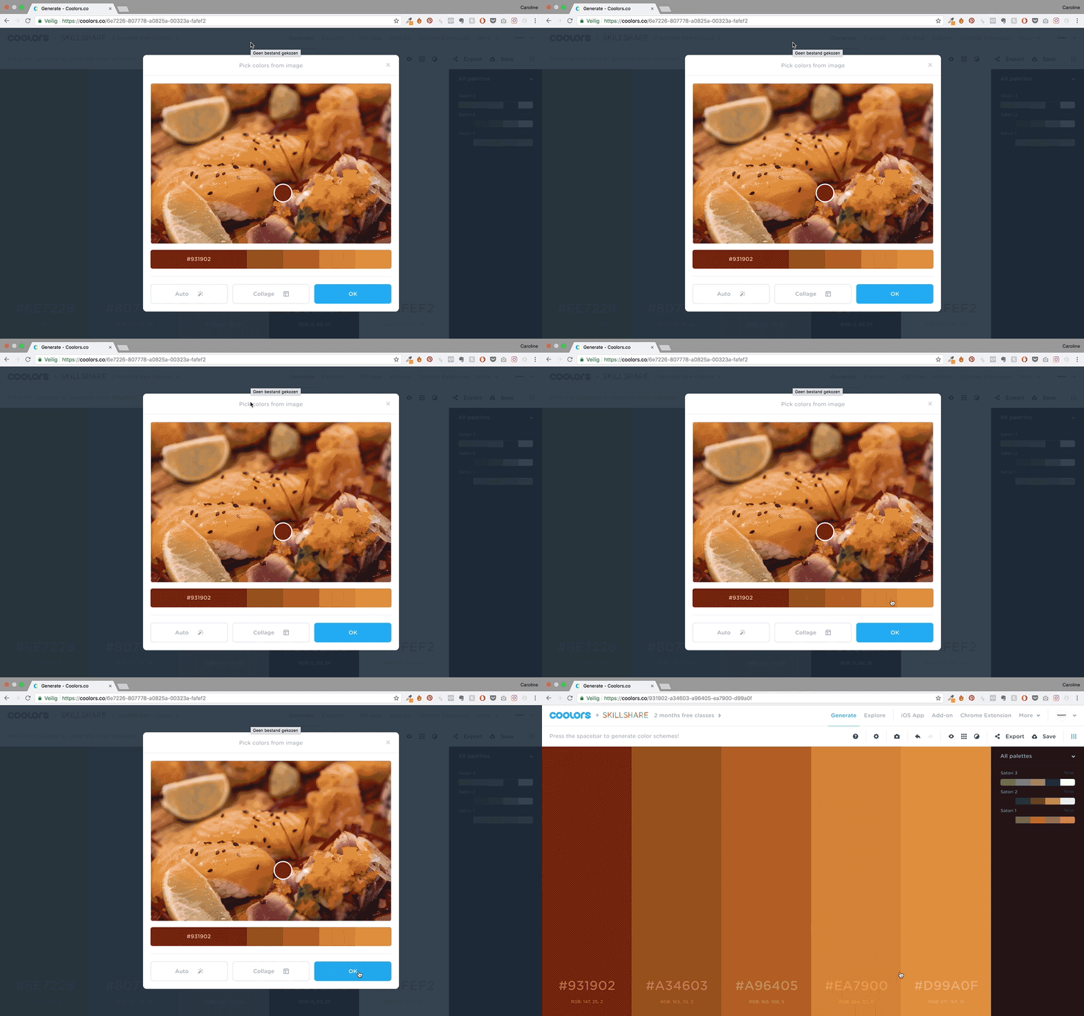
- Then go to https://www.coolors.com. Upload the first image in your folder. The tool will now automatically create a color palette based upon this image.
- You can change some of the settings if you want to. But you don’t have to. This is why we are going to upload multiple images: by going through a variety of photos, we’ll see which colors recur the most.
- Hit “OK” if you feel like the color palette is okay. And then save it with the save button in the upper right corner. Name the file [Brand Name 1]. By numbering them, we can call the final one [Brand Name].
- Now go through the same process with the other pictures you selected.
- All uploaded? Then you should now see the different palettes on the right side of your screen. It’s highly likely you will see a few colors multiple times. These are the colors we are going to use.
- Pick the palette that you feel like most represents your brand. You probably already have 1 or 2 brand colors, like the ones you use on your website or in your logo. Make sure to change the colors in the palette that are most like these first.
- Then edit the other colors. Pick the ones that you feel like are most representative for your brand. Change the colors in the palette that were not yet locked.
- Then save the final palette as [Brand Name]
- And export it as a PDF. Tada, there’s your brand’s color palette

But, not so quick!
Before you start using this color palette everywhere, we should make sure it fits your style. Three things we should do.
- Let’s upload the collage you made on the course and look at the colors. We want there to be at least 3 colors that are quite similar to the palette you just made.
- And we need to take a look at your brand’s personality words. Do the colors match the words you chose? This is a little bit of an abstract exercise, but we all understand that bright pink might not be the best color for a ‘bold, masculine, outdoor’ brand.
- You might also want to check if the meaning of the colors you are using fit your brand’s personality. To do this, I’d advice you to read the common meaning of colors here.
What’s next?
Now that you’ve got your color palette, it’s time to use it. How to apply your palette and how to use it with influencers, is explained in the next blog post. Good luck!
Read on
- How First Watch Built The Best Restaurant Instagram Strategy 🍳📲
- Do You Actually Need a Property Management System? Let’s Break It Down. 🏡
- How Hotel Albergo Masters Luxury Hotel Marketing on Instagram
- ManyChat for Restaurants: How to Use Automation to Drive Engagement & Boost Bookings 🚀
- Restaurant Marketing That Works: Chuy’s Fun and Relatable Tex-Mex Marketing 🌮🎉


