In this article we will talk about creative restaurant logos and why are they important for your business. When opening up a new restaurant, having your guests instantly recognize your brand and associate it with your food is absolutely essential.
Imagine yourself walking down a busy street, looking for a place to have lunch at. As you walk around, you glance over the sea of potential restaurants. What catches your eye and makes you look at their menu?

Also check out these 100 Creative Hotel Names!
Why is a creative restaurant logo important?
My friend Daria, who is a graphics designer, shared her opinion on why creative restaurant logos so important:
“Logos as well as entire corporate identities are an essential part of any brand. With the right branding, you can set the tone of voice for your restaurant, attract the desired target audience, become a recognizable brand that is easily memorized and recalled by customers.
Think of brands like KFC, Starbucks, McDonald’s, or Olive garden. I’m sure that when you try to picture them, you can picture their logos because of how simple and recognizable they are. Sometimes just the color scheme alone immediately ties your thoughts to a specific brand. The magenta pink of T-Mobile, the red, white, and grey of H&M, the black and white stripes of Sephora.
Brands surround us. If you look around, logo signs, banners, and leaflets, however good or bad, can be found anywhere you look. That’s why design is important. Creative restaurant logos will catch someone’s eye. It helps to draw people towards a restaurant, welcome a person in, while bad design can subconsciously make one avoid the place and choose something that looks more professional and sophisticated.”
Now that we understand why creative restaurant logos are so essential, let’s look at these 7 examples below!
Burrito Loco
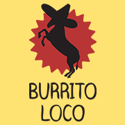
Burrito Loco is a fast-food Mexican restaurant operating in Prague. It is the most popular Mexican fast-food chain among locals. It quickly became popular for its affordable food and recognizable from the first glance. Their logo fits perfectly in this list of creative restaurant logos. The logo clearly shows what cuisine it is and its red and yellow background catches your eye immediately.
Noma
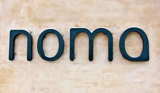
The high-ranking Danish restaurant got its name from the combination of Danish words for “nordic” and “food”. Their logo is clean, bold, and simple, yet catches your eye.
Nordsee
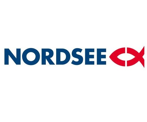
The German chain offering seafood has a logo anyone will recognize from the get-go (unless you’ve never eaten out). The fish in the design immediately tells you what to expect and the blue color corresponds with its name.
Do you need a Creative Restaurant Logo? Then let’s get in touch.
Aqua

Another restaurant located in Germany, rated with 3 Michelin stars, uses only font for its logo. And even as simple as it is, it works. One look is enough to see the elegance and punctuality this restaurant offers.
Ramen brothers
The design of this restaurant located in Utrecht, Netherlands is very smart. The circle forms a bowl and the lines suggest its dish – ramen. Very simple yet effective.
Wild chix waffles

Restaurant Chicken Logo is an often searched term on Google, hence we had to add one to this article! Many restaurant chicken logos show roosters though and are not that creative. We, however, found this one for Wild Chix Waffles, and man, do we love it! It’s creative, different, unique, and authentic. We bet you won’t find anything similar somewhere else. Which is a huge + for any logo: originality. Having a logo that no-one else can easily recreate.”
Starla hotel and restaurant
Looking for an elegant restaurant logo with a star? Check out this one made for Starla. You can tell right away that this is a fancy hotel/restaurant. We like the similarities between the font and the logo itself. This enhances the power of the logo. The golden touch is a sweet extra, adding on top of the top-quality-feel.
So what have we learned from these 7 creative restaurant logos?
Your cuisine can be extraordinary, but without the right branding, it’s very hard to spread the word. If you’re an aspiring restaurant owner, make sure your idea shines through your design.
The logo is the big pillar of your complete branding, but it has to make sense in connection to your interior, menu, and the overall tone of your brand. It doesn’t have to be a super complicated logo design, but keep in mind that it has to be something that’s memorable right after the first glance.


