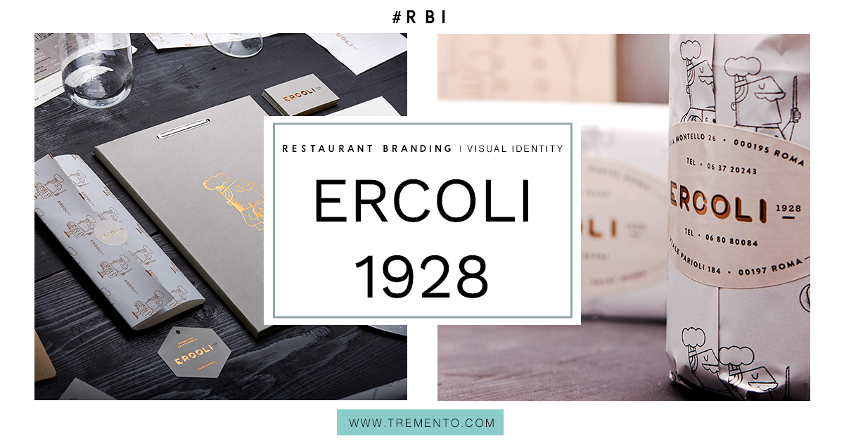
That’s what the page for the branding project for Ercoli 1928 starts with. And so I felt intrigued, because yes, I am a lover of food and wine. Almost nothing beats a home-made pasta or smothered-with-mozzarella pizza accompanied by a delightful glass of red wine. I reached out to Daniele Simonelli, the designer of this project, to learn more.
Daniele works mainly as an illustrator, digitally crafting illustrations for design studios, agencies and direct clients from USA, UK, and Italy. Thanks to an earlier job, he landed this project for Ercoli 1928.
“The style of the restaurant comes from many different meetings I had with the client. They envisioned a vintage styled shop/restaurant, which is a well known formula in Rome, known as “pizzicagnolo”. But with a lighter approach.
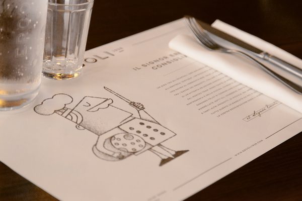
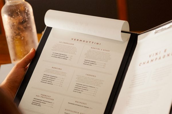
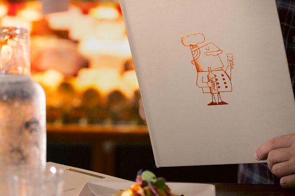
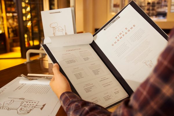
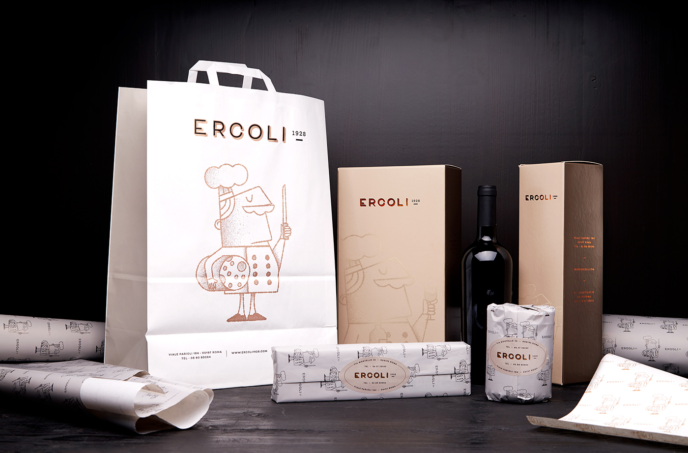
“First, we developed the logotype referring to the old Italian shop’s sign and their typography. Then we developed the character of Mr Ercoli, which is meant to guide the customer into the full Ercoli 1938 experience. I proposed a few sketches, and they immediately fell in love with the one now used in the branding. As a final touch, we decided to use some stylish printing techniques as copper foil on prestigious paper.”
That’s, to me, the most interesting part of this project: Mr Ercoli. He forms a mascot for the restaurant. This has many benefits, the most important one being that it makes it easier for visitors to ‘bound’ with the restaurant. They’ll feel like they know Mr Ercoli at some point. Another benefit is that it’s much easier to create a consistent style by using one and the same mascot over and over again through multiple channels.
Provide an experience, touch the heart
Daniele: “A restaurant is not simply a place where you eat, it’s an experience that involves all the senses. Obviously the taste and smell, but also the eye of the customer. Developing the right brand identity will help you to touch your clients heart.”
And when you touch a customer’s heart, you got ’em. Those are the ones turning into repeat customers or the ones leaving you good reviews. They will promote your restaurant through word-of-mouth and bring friends with them the next time they come along. Like Daniele says: a restaurant is not just a place where you eat. Provide your guests with a complete experience. Offer them good service and high quality food. After that: take care of your branding. Create a consistent brand image and message throughout your communication. Connect the dots so you guests can truly get to know your brand. Give them the feeling you are friends. The benefits will follow.
Find out more about Daniele (the designer) here:
https://www.behance.net/dsgn89
Did you find this helpful or interesting? Then please leave a comment! Also, if you know any other restaurant which I should check out because of its visual identity, please let me know.
> I post an inspirational example of great restaurant branding every 2 weeks. If you want to stay updated, make sure to become part of the Tremento Tribe.

