To read why I’m writing these series, please check out the first post here.
This week we are going to look at the third bar in the Instagram Cocktail Bar Series: The Green Hour. Why they are featured? Well, this is content consistency at its highest level. Find out more below.
Bar 3: The Green Hour
Instagram: https://www.instagram.com/the.green.hour/
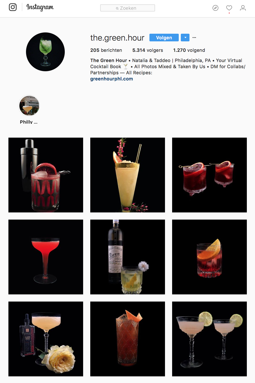
Photos won’t get more consistent than on the page of cocktail bar The Green Hour. That’s for sure. This Philadelphia based cocktail bar is (in their own words) ‘Your Virtual Cocktail Guide’. All photos are made by themselves.
What do they do well?
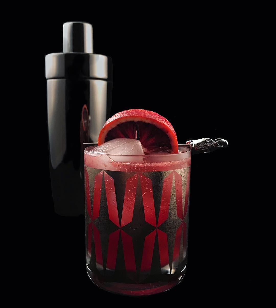
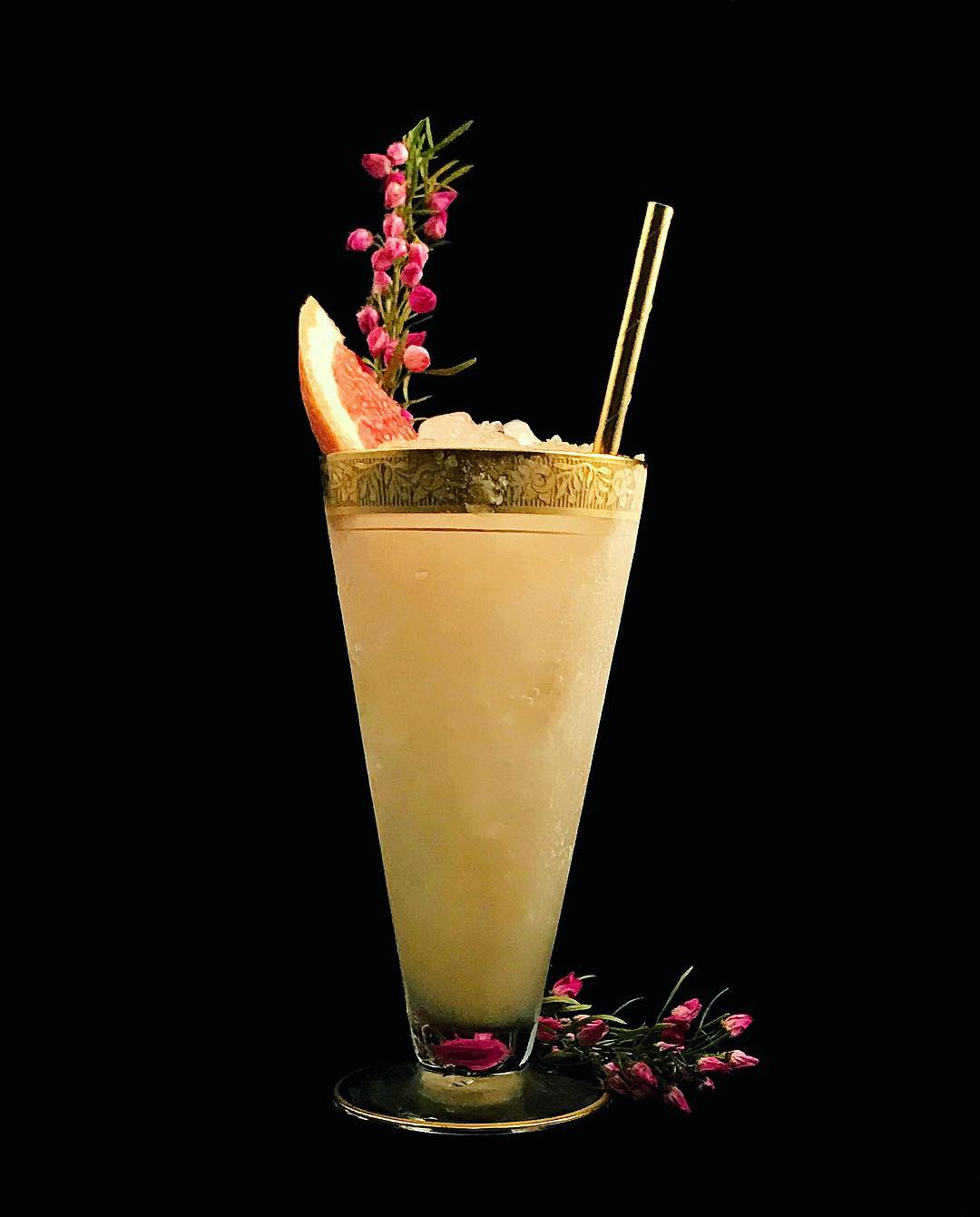
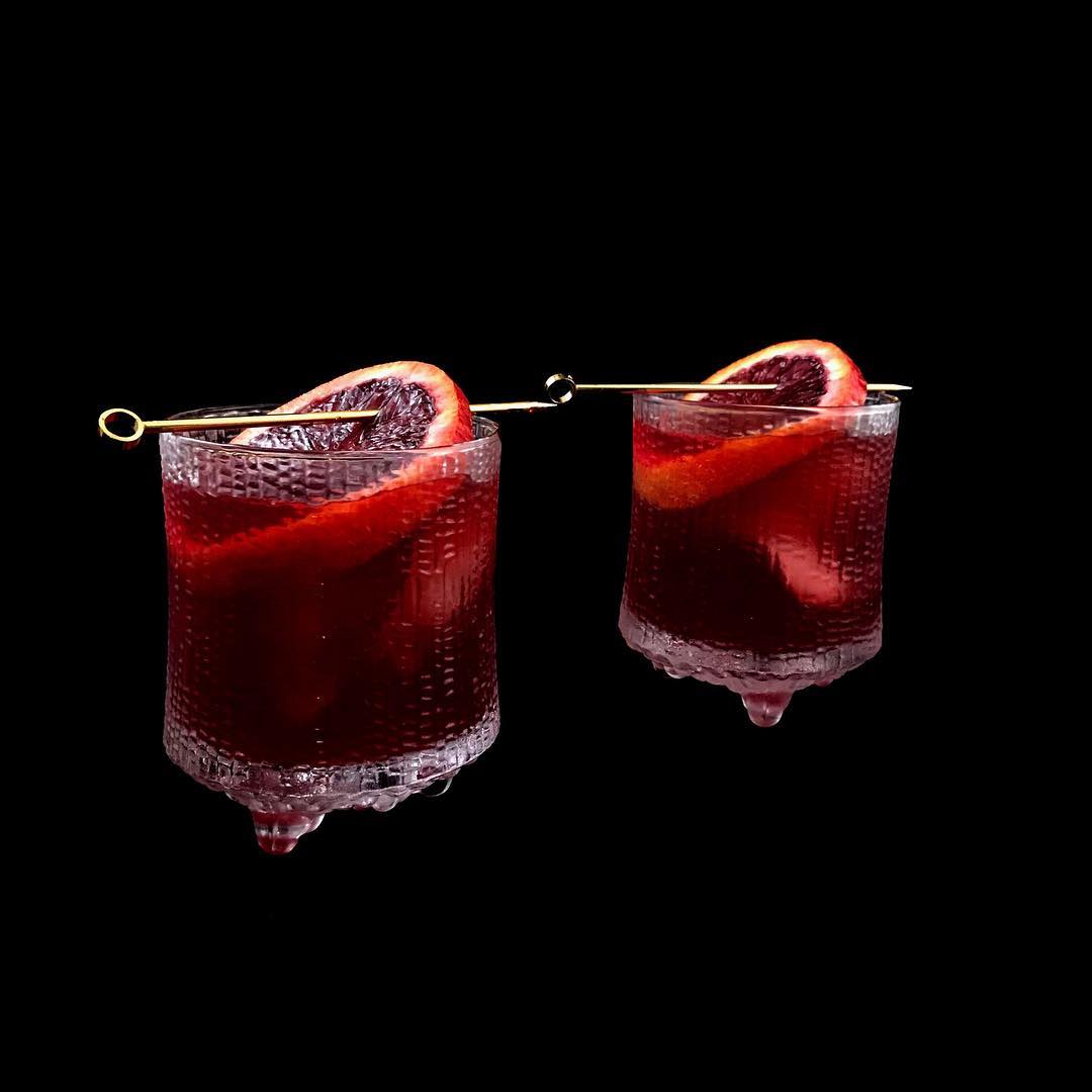
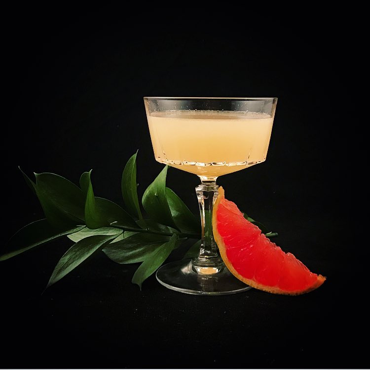
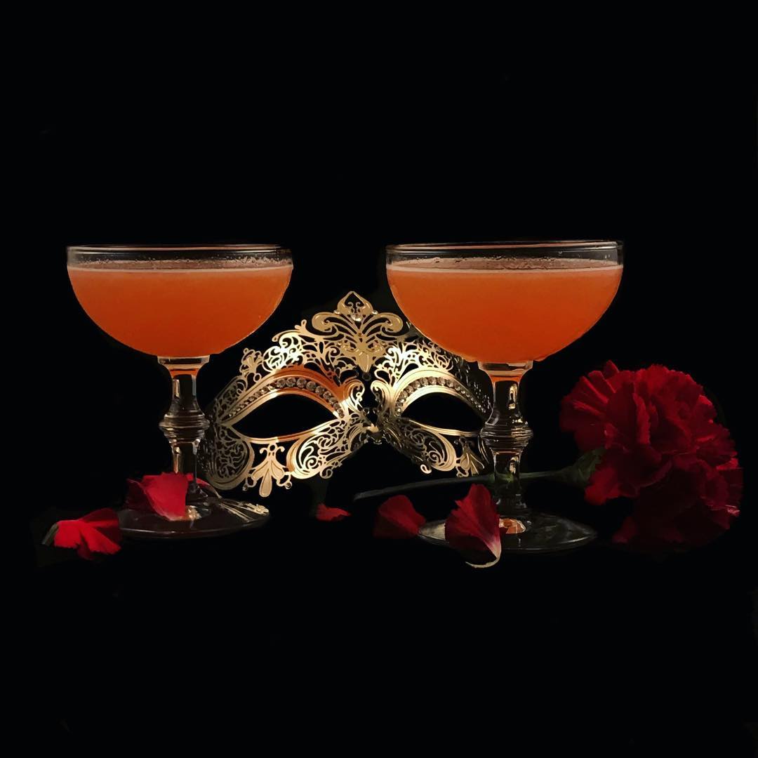
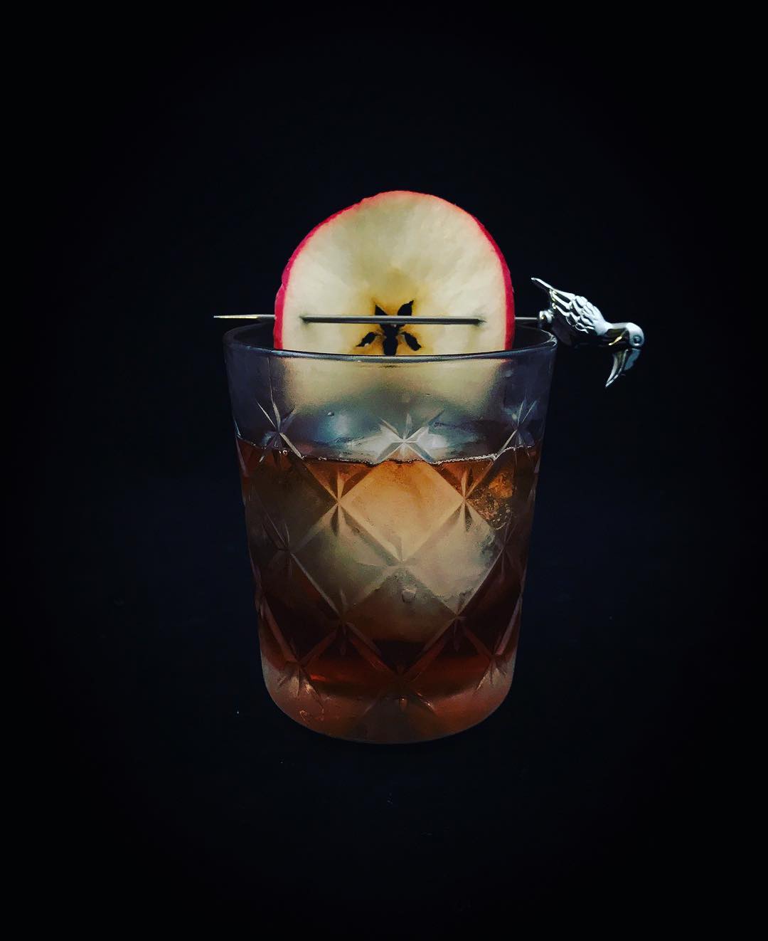
Consistency. That’s obvious. All pictures on this page are in the exact same style. We could even discuss it gets a little boring but it’s a choice they’ve made and it seems to work for them. The photos get high amounts of likes and always a couple of reactions. And: they reply. There are conversations going on here.
Secondly, their captions. No useless text here but descriptions of the drinks and sometimes even the recipe.
Thirdly, the visual styling of their photos. They are incredibly well produced and captured. The props, the black background, the lightning. All of it works together to create an image in which the cocktail is presented as a true superhero. And since the cocktails are their main product, there’s no reason not to do this.
What could they do better?
We could discuss if more variety in the pictures would be a good idea, but I think it works for them. They have created a very specific profile for their Instagram account and it’s likely that their concept attracts more new people than if they were just posting pictures of their bar. By creating this unique concept, they are setting themselves apart from the crowd.
However, what could be improved are their Instagram Stories. They’ve decided to publish one Instagram Story on their page, but it’s just one, at it seems a little random. The pictures in that story have a completely different style. Which is OK, if this was the case for all their Instagram Stories and if they’d communicate a clear objective for their stories. I’d think of it as a great idea to set up 4 different stories, one about the ‘vibe’ with pictures of the place itself and the guests, one called ‘daylight’ (where the cocktails are shown as they are right now in that one story that they’ve got up and running), one called ‘bites’ in case they also serve some food or bites, and one about their promos.

