If there’s one thing essential for a hospitality brand nowadays when it comes to online marketing, it is having a website. A good restaurant website design will help to establish a strong brand name online. A little while ago, I took a look at a few different coffee shop websites. In this blog post, I’m going to give you a few restaurant website design ideas by showcasing a few of my favorites from restaurants in the city of Amsterdam.
These websites touch all categories, from playful to classy and beyond. Which is your favorite from these restaurant website design ideas?
1. The dynamic website design of Pesca Restaurant
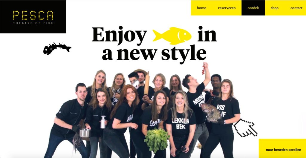
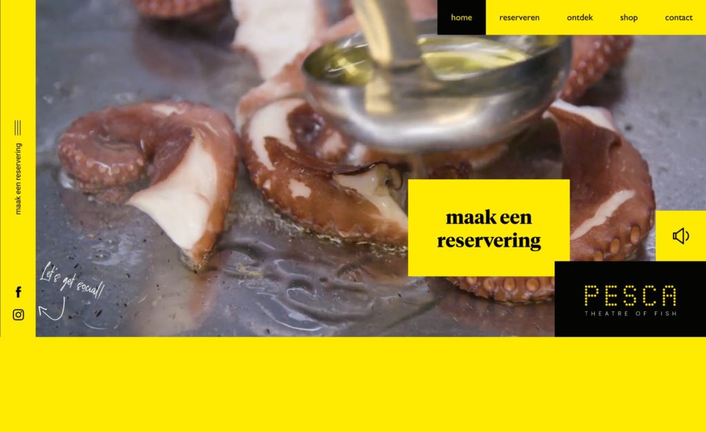
I’ll start with my favorite: the website of Pesca. This seafood restaurant is at the top of my must-visit-in-Amsterdam list and their website does nothing but emphasizes that feeling. It’s dynamic, playful, and creative.
2. Classy design by Bougainville Restaurant
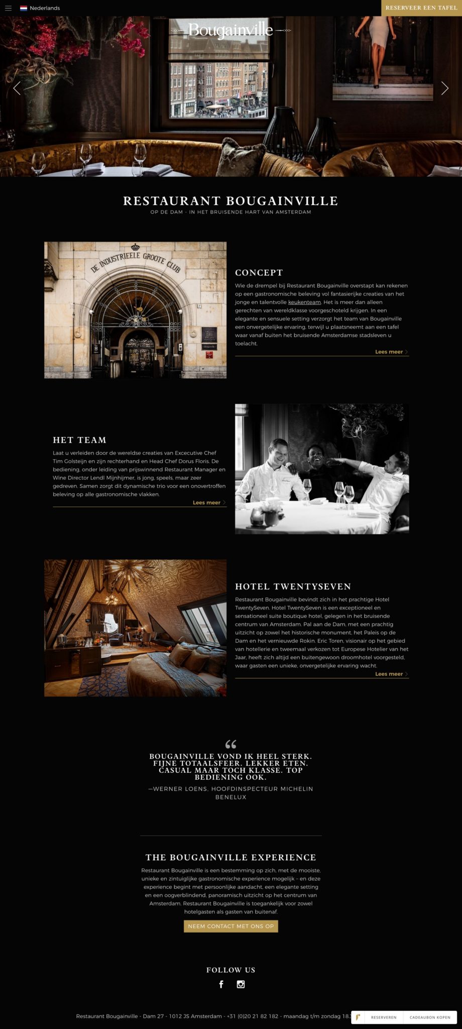
The second restaurant website design idea that I want to share with you is this one, from Bougainville. This website tackles another side of the design spectrum: it’s fancy, classy, high-end. A great example of how a website can help to build your brand: by visiting this website you already get a good idea of what to expect at Bougainville. They succeeded very well in translating their offline experience into the online space.
3. Le Bistrot Des Alpes – Playful Restaurant Website Design Idea
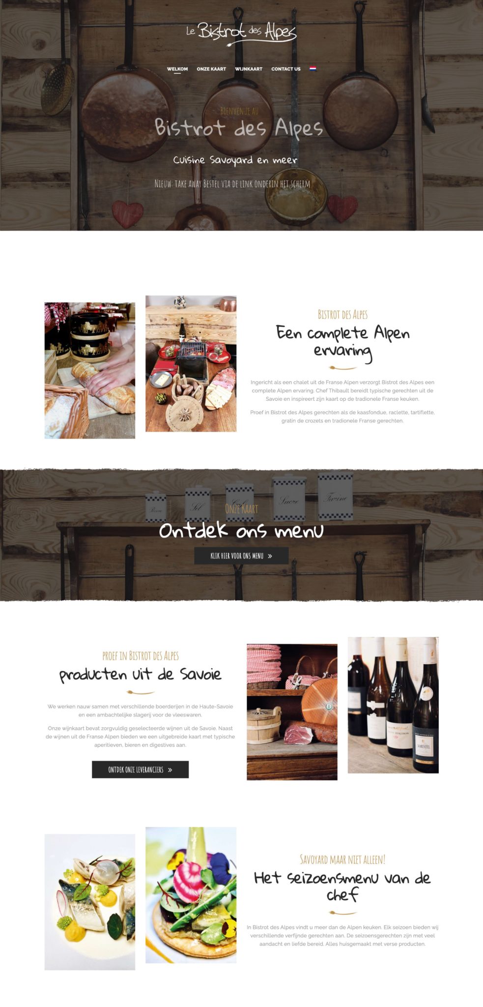
The next restaurant website design idea that I want to share with you is this one by Le Bistrot Des Alpes. This website fits neatly in between the first two examples I shared. It’s elegant and organized, yet playful thanks to the customized title font. They make smart use of white space to break up the page in different color blocks.
4. Bhatti Pasal – A clean design, but…
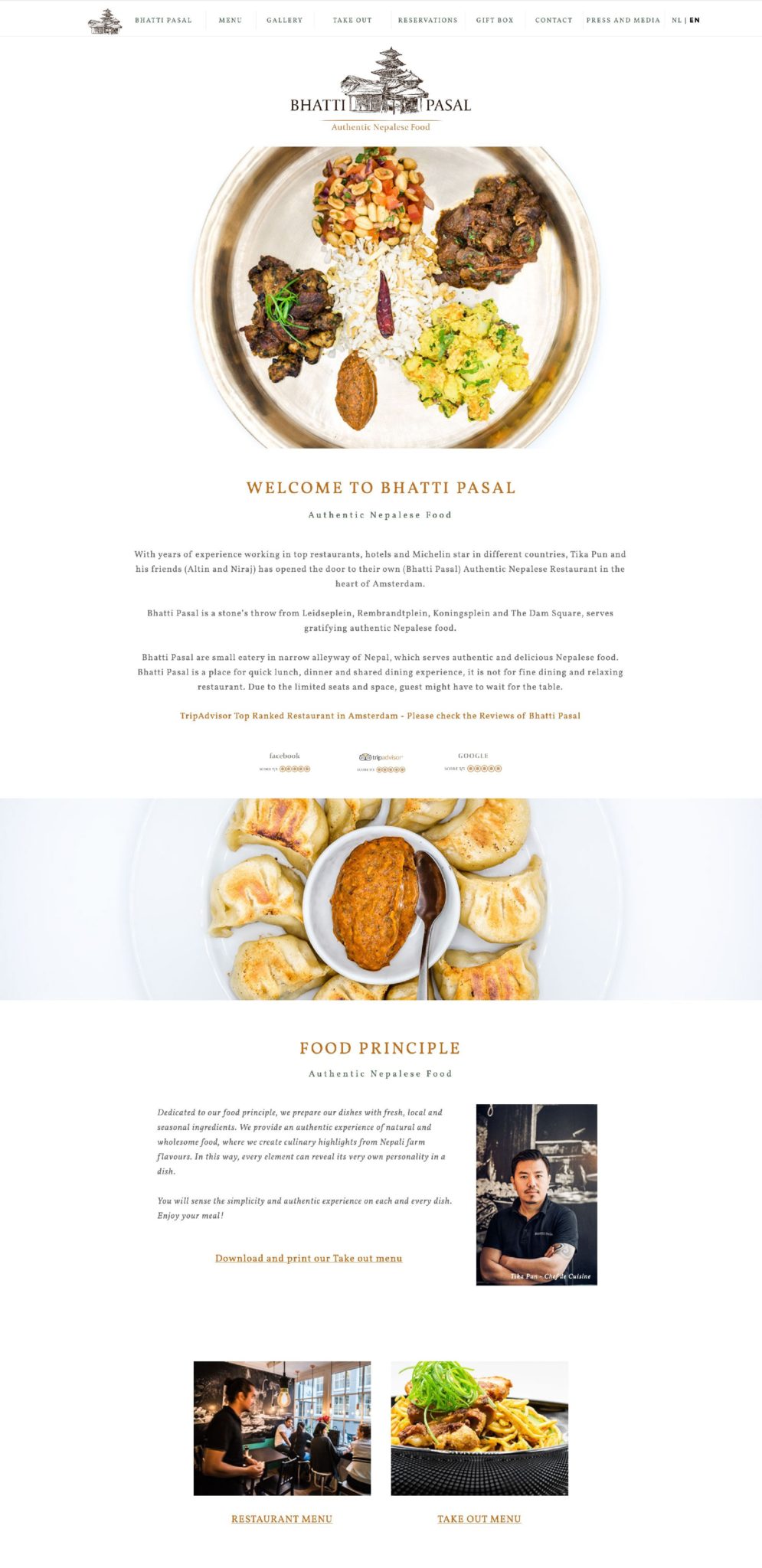
This is the website of one of my favorite restaurants in Amsterdam: Bhatti Pasal. If you are ever to visit the capital of the Netherlands, then make sure to head over to Bhatti Patal (and make a reservation if you don’t fancy waiting outside!).
I do have to comment though that the website of Bhatti Pasal does not really translate the feeling you’ll get inside the restaurant. The website is very neatly organized, looks super clean and rustic, whereas the restaurant itself is quite small and chaotic. This is a completely other experience than the one shown online. I do think that’s risky, and I’d never recommended anyone to do the same. Because you do risk setting wrong expectations.
And if I’m super honest: that’s exactly what their website did with me. I first checked them out online and got very excited to visit them and try their food. Once I arrived we had to wait outside for about 45 minutes, because the restaurant is TINY. Once we finally got a table, we had to sit with two complete strangers. The food barely fit on the table and our sodas were served in their plastic bottles. This is not what you would expect after visiting the website.
Now, their food is amazing and it made up for deceived expectation, but I did want to share this story with you. Because as you can see underneath, their website looks super neat. It’s beautiful. I love the design. But it does not translate the restaurant experience. So something I’d say needs improvement!
5. Restaurant de Kas – Easy Navigation WORKS
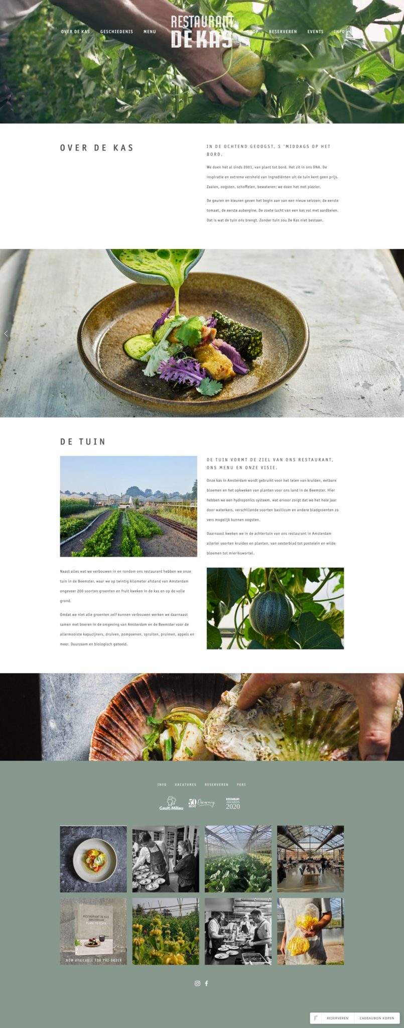
The next restaurant website design idea I want to share with you today is this one by Restaurant de Kas.
This image is actually not of their homepage – which I think is quite a confusing page and needs improvement. You can only bypass the homepage after choosing a language and I can tell you: my grandparents nor my parents would ever understand this. They’d just close the website after seeing the homepage. A bad design choice, in my opinion, and experience.
But, okay, I still wanted to share this website. Why? Because once you have bypassed the homepage, it’s beautiful. It’s then easy to navigate, the overall look is fresh and there’s not too much information on each page – which I like. Also, their menu isn’t too elaborate. I often come across restaurant websites with over 7 menu items (meaning, the website menu, not their food menu). But the human mind will have forgotten about the first 3 by the time it sees number 7. Try to keep your menu options limited: 4 to max 7.
6. The Chicken Bar – Colorful Restaurant Website Design
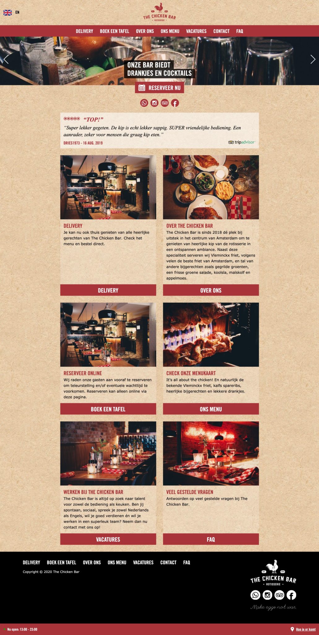
The final feature in these restaurant website design ideas is The Chicken Bar. You may wonder why I wanted to share this one, as it’s nothing fancy or outrageously creative. However: this one is so easy to navigate, and the styling 100% fits the brand. They adjusted all the colors and don’t use any white – which makes them instantly different from most restaurant websites.
I’m a big fan of whitespace, but in many cases, adjusting the colors is a great idea. It quickly helps to make a website fit your general brand design. It definitely did here!
So what about your restaurant website?
Do you already have a website for your restaurant? Is it up to date, is it responsive (meaning: it also functions perfectly on a smartphone)? Is your website being seen by Google, and does it provide your guests with all the information they might need? Your menu, opening times and so on?
If the answer is no, then it’s time for you to check out our website design service. We design websites for hotels, BnBs and restaurants, and bridge the gap between ‘do it yourself’ and ‘spend a fortune on a designer’.
Just note: we only do website design for hospitality brand owners. So restaurants, cafes, coffee houses, food trucks, hotels, bed and breakfasts and other accommodation providers. Our websites are structured to serve this exact audience. So if you are like a retailer, a gym, a lawyer firm, a therapist… then sorry, this isn’t for you!

