To read why I’m writing these series, please check out the first post here.
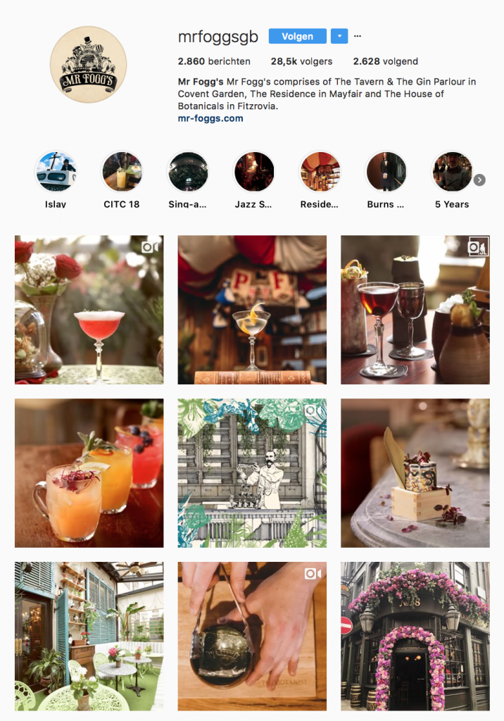
In this post we are going to look at the fourth and last bar in the Instagram Cocktail Bar Series: Mr Fogg’s. Why is this bar in this series? Because of the strong variety of content while at the same time maintaining a clear brand image. That should be everybody’s ultimate goal, really.
Bar 4: Mr Fogg’s
Instagram: https://www.instagram.com/mrfoggsgb/
Mr Fogg’s wins the award for the most interesting videos I’ve found so far. Their cocktail videos are dynamic, well-styled and use the right music for the tone they’re trying to set. The animations in their videos make them stand apart and the slow-motions are gorgeous.
What do they do well?
First of all, the videos. They’re fast paced, yet not too energetic or hectic for a classy cocktail bar. The videos support the brand’s image. How? By staying true to the color palette, showing off the expertise of the bar and maintaining an overall English style – something the bar seems to aim for.
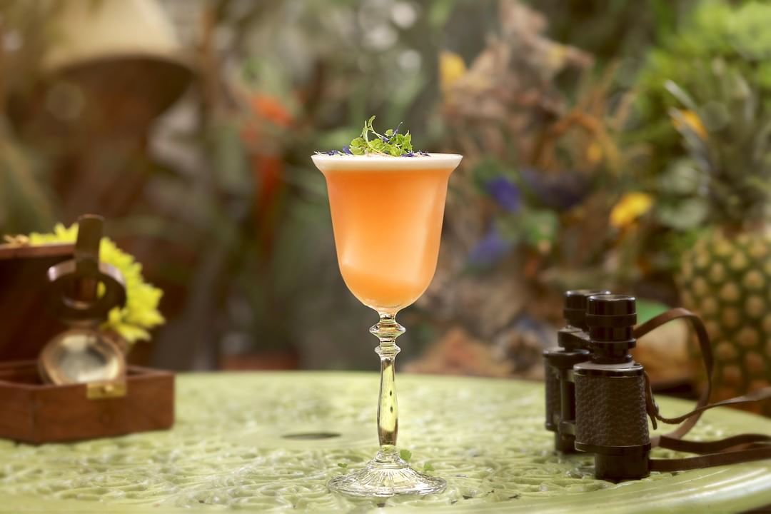
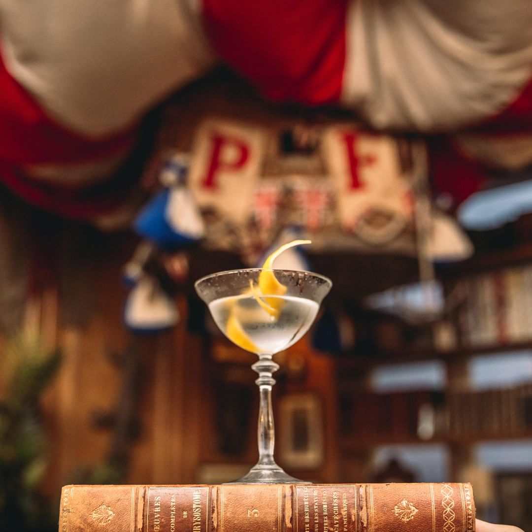
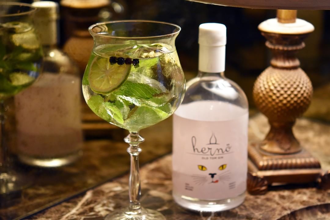
It looks like there’s a concise Instagram strategy going on here. The posts show a variety of interior, exterior, drinks and food. The platform gives the fans an idea of the atmosphere of the bar.
All posts are high-quality and well-produced. The bartenders look just as styled as the pictures. And so does the bar. Everything just comes together in this account. And again there’s a strong color palette going on that all posts stick to. The visual style has clearly been defined.
What could they do better?
There’s only one thing I can think of and that is.. engagement. The account itself is beautiful but there is barely any interaction going on. The bar doesn’t respond to fans replying to their posts, nor do they really invite people to get active. They do stimulate their fans to use a certain hashtag but if you don’t do anything with those posts afterwards, what’s the use?
What can we learn?
- It’s becoming a recurring lesson, but: set up a color palette for your posts and stick to it. This can best be done by creating a mood board with one ‘open’ spot. The picture you want to post can then be dragged into it and this way you can easily check if it’s aligned to the style you’re aiming for or not.
- Fast-paced, well-produced and high-quality videos. Observation goes a long way: what is it that makes these videos so good? It’s the way they maintain the overall style of the brand and show the fans how the cocktails are made.
