Regardless of whether you have been running a fine-dining bistro or restaurant for years or have just opened a startup, you cannot do without an attention-grabbing menu card. A menu card with a compelling and enthralling design comes a long way in effectively promoting and positioning your brand. A well-designed and elegant menu card play a key role in helping create and reinforce a strong brand identity for your restaurant or café. The way you design your menu could coax and encourage your patrons to not only order traditional fare but also try out unconventional offerings – that’s why we bring you a list of 10 menu design ideas to get some inspiration from.
So what should your primary concerns be?
Your restaurant’s menu card should be uniquely designed so that it mirrors the eatery’s persona, ultimately wowing visitors with its overall aesthetics. You can make the most of your menu card by using it as a tool for advertising your brand.
On the other hand, an ingenious and stylish menu could entice customers to revisit your restaurant and enrich their experience. Presently, there are over 1 million restaurants throughout the US (and the numbers are rising continuously) that compete aggressively for tempting customers, using innovative promotional strategies.
Presenting an exciting and riveting menu card is one such advertising technique that almost all restaurants resort to. The following are ten menu designs of high-end fine-dine restaurants from select cities throughout the world that’ll titillate to do over your eatery’s menu straight away.
Eleven Madison Park, New York
If you think that a minimalistic look and feel is passé and may not suffice to tempt visitors to your restaurant, then take a look at Eleven Madison Park’s menu. Overlooking the Madison Square Park in Manhattan, and housed inside the Art Deco building on the junction of Madison Avenue and 24th Street, Eleven Madison Park has a laid back yet imposing feel to it.
The menu card reflects the minimalistic design of the restaurant’s décor. It features just 16 key dishes elucidated in only twenty-eight words, ditto for the restaurant’s wines and cocktails lists.
Understandably enough, customers do not have to leaf through pages to choose what to order.
Vera, Saragoza
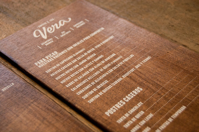
The menu card design of Café Vera (Zaragoza, Spain) is as simplistic as it can get. But, it still leaves a lasting impression. It has been designed by a team working at El Calotipo (a printing establishment).
The team selected alphabetical characters that perfectly embody the F&B offerings of Cafe Vera. The fine print on the menu card has been done manually using an in-house press.
The prices of the dishes have been embossed on detachable stickers so that the charges can be updated as and when required. The printing has been done on hardwood typified by complex design to hold the patrons in thrall.
The Pelican, Singapore
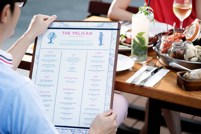
When you take ‘The Pelican’s’ menu card in your hand, you’ll instantly feel the bill of fare exudes an aura of American southern seafood specialties. Every dish starting from the Classic Lobster Brique to The Pelican Lobster Burger and everything in between exemplifies a nautical theme.
The menu’s design is full of different illustrations of seafarers, fishers, and marine animals.
Hiding in Plain Sight, Amsterdam, The Netherlands
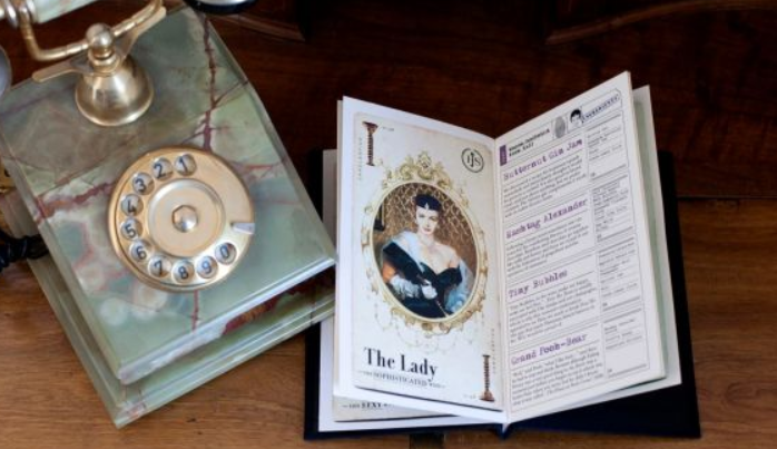
Hiding in Plain Sight, admiringly referred to as HPS by the locals, is one of the most well-known watering holes in Amsterdam experiencing a high footfall throughout the year. The moment you step inside the HPS, you’ll travel back in time. The decor will bring you to the days of the freewheeling and high-spirited culture during the 1920s in the US, called ‘Roaring Twenties.’
The menu card has been designed and themed around the roaring twenties culture, and the bill of fare is bound in leather and styled like a book. The titles, illustrations, and representations in the menu have an air of exclusivity about them, sure to rivet your attention.
Noble Experiment, San Diego, US
The menu card of Noble Experiment looks as quaint and old-world as the speakeasy itself. Cocooned inside a restaurant in the Gasland Quarter known as Neighborhood in San Diego, the bar is a real hidden gem.
The menu has got embossed letterings that on a premium quality paper. Also, the literature is as variegated as the drinks.
Discover Your Way, Patras, Greece
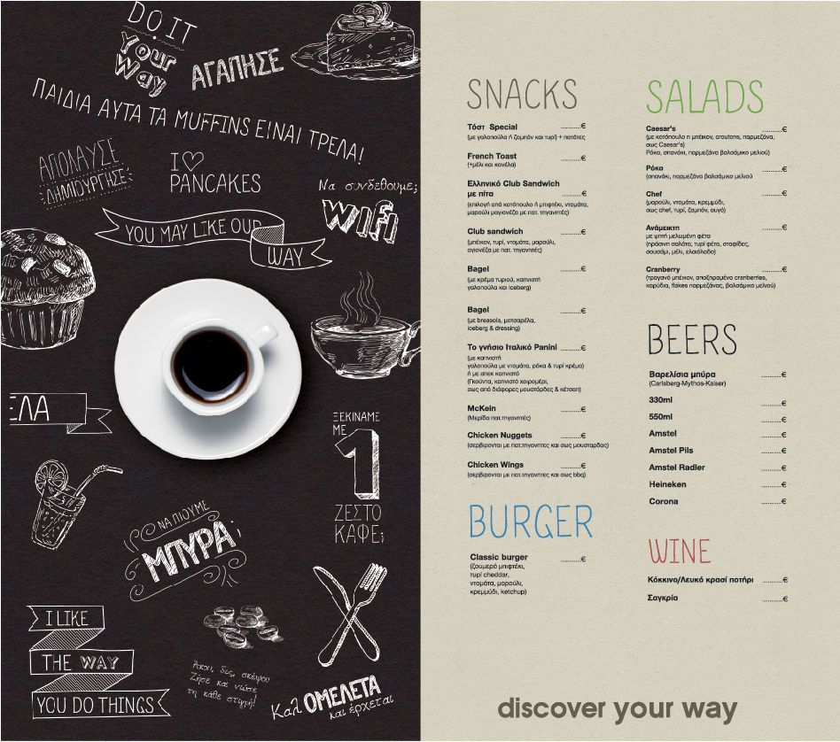
This is a restaurant hidden inside a bookstore. And the menu is a perfect blend of representations and pictures that exude a chalkboard look.
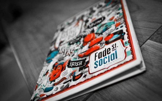
Fade St. Social, Dublin, Ireland
Fade St. Social’s bill of fare was created by Steve Simpson, a reputed illustrator based in Dublin, the Irish capital. The menu appears striking with motifs and illustrations that embody the elegant décor and the foods.
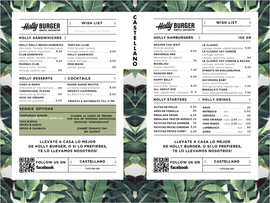
Holly Burger, Spain
The menu card design of Holly Burger in San Sebastian, Spain, takes inspiration from drawings and paintings that were popular during the 40s. Created by Rodrigo Aguade and Manuel Astorga, the bill of fare features handwritten typography on a banana leaf wallpaper background.
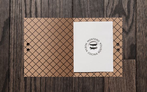
Montero, Mexico City, Mexico
The avant-garde menu of Montero was designed by Anagrama, a graphics firm based in Mexico City. The menu personifies the times when Mexico was under colonial rule.
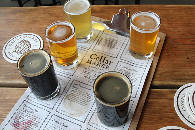
Cellarmaker Brewing Co, San Francisco, US
The creative and ingenious design of the Cellarmaker’s menu enables the visitor to easily choose a dish and beverage from the gamut of cuisines, appetizers, and beverages.
Conclusion
A menu has always been a pillar of a restaurant’s visual identity. No matter who your customers are, ALL of them will have the menu in their hands for at least a couple of minutes. That’s why you have to make sure they like what they see… And, hopefully, you got some amazing ideas from our article.
We understand that not everyone knows how to approach all the challenges in digital marketing. That’s exactly why we created the Tremento Tribe program. Check out the page to see when registration is open.

